Brand identity · Edition 01
The art of breathing well.
Live better. Live longer.
Premium oxygen chambers that generate their own oxygen, hand-built from aircraft-grade aluminum and made to order for homes, spas and performance teams. These guidelines set out how the Oxyliving brand looks: the mark, color, type and image.
01 — Manifesto
High oxygen.
Precisely engineered.
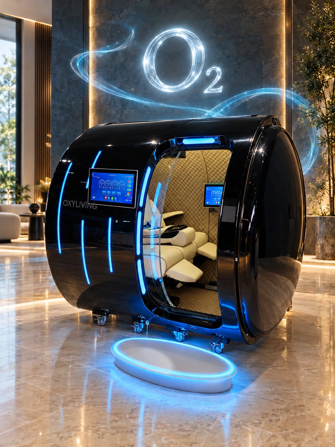
Premium oxygen chambers that generate their own oxygen, hand-built from aircraft-grade aluminum and made to order for homes, spas and performance teams.
On-site oxygen
93% concentration generated inside the system — no external tanks to store, swap or refill.
Aircraft-grade build
Seamless 508x-series aluminum bodies, engineered and welded to certified tolerances.
Made to order
Any RAL Classic color outside, 280+ upholstery materials inside, seating or bed layouts.
02 — The mark
An open circle.
A single breath.
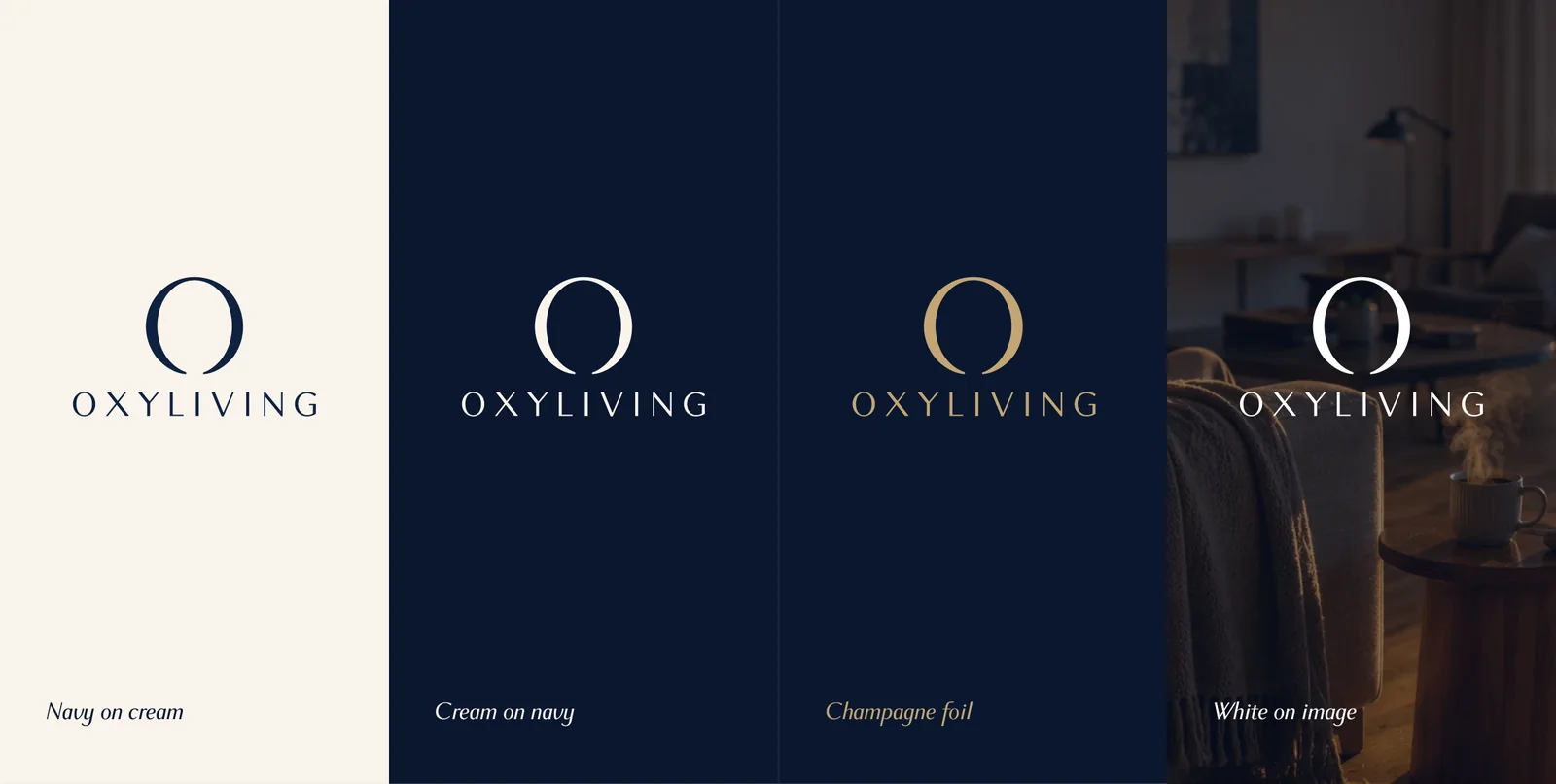
The symbol, wordmark and tagline form one signature. They are used as supplied and never redrawn, respaced or recolored outside this guide.
Logo system
Versions
Clear space & size
Give it room to breathe.
Keep a margin equal to the height of the O in the wordmark on every side.
| Minimum size | Digital | |
|---|---|---|
| Stacked | 1.25 in | 160 px |
| Horizontal | 1.75 in | 200 px |
| Symbol | 0.3 in | 24 px |
Misuse
Restraint is the rule.
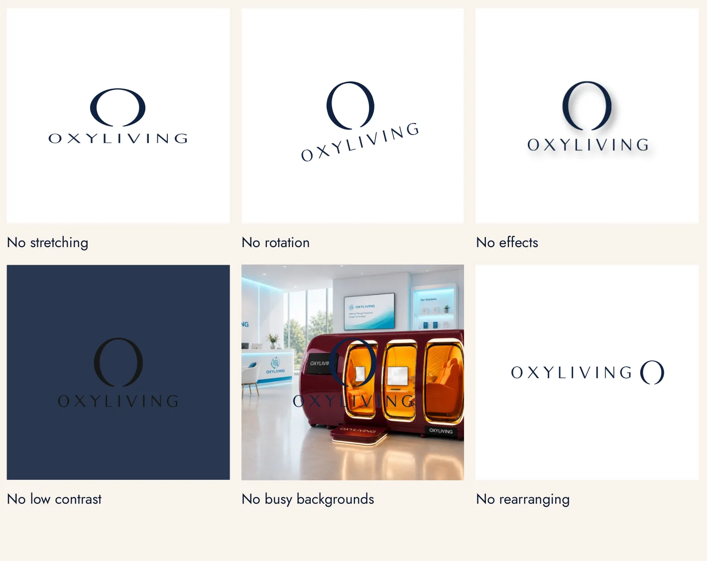
The logo is never distorted, decorated or crowded. If in doubt, use the navy-on-cream version on a quiet background.
- No stretching
- No rotation
- No effects
- No low contrast
- No busy backgrounds
- No rearranging
03 — Color
Midnight, cream
& champagne.
Four colors carry the brand. Pantone and RAL are closest matches.
Oxyliving Navy
- HEX
- #10223F
- RGB
- 16 34 63
- CMYK
- 100 85 40 50
- Pantone
- 289 C
- RAL
- 5011
Midnight
- HEX
- #0B1730
- RGB
- 11 23 48
- CMYK
- 100 85 45 65
- Pantone
- 5395 C
- RAL
- 5004
Champagne
- HEX
- #C4A574
- RGB
- 196 165 116
- CMYK
- 20 30 60 5
- Pantone
- 7502 C
- Foil
- 871 C
Cream
- HEX
- #FAF4ED
- RGB
- 250 244 237
- CMYK
- 0 2 5 0
- Pantone
- 9224 C
- RAL
- 9001
Every shell is lacquered in the RAL Classic system — every finish, made to order. See the Exterior Color Chart.
04 — Typography
Two families,
clear roles.
Headlines, statements and the logo.
Body copy, captions, labels and interface.
05 — Imagery
Light, stillness
& craft.
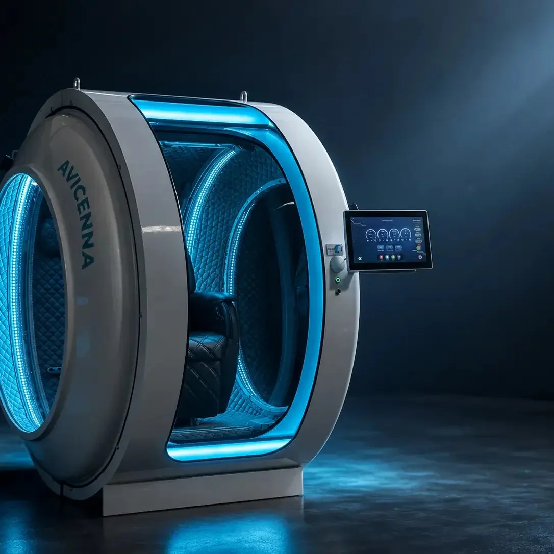
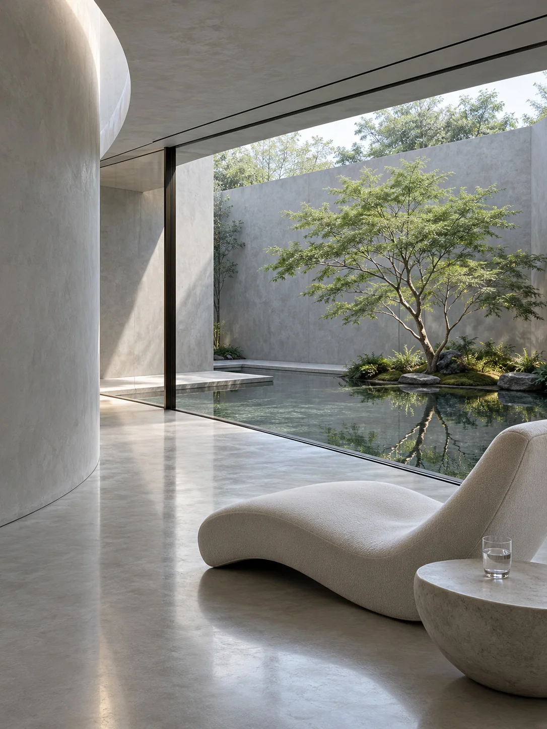
Two worlds in every story: the chamber as a luminous, sculpted object, and the calm architecture it lives in. Crops follow the arch and circle of the symbol.
06 — Downloads
Take the brand
with you.
Press, partners and distributors: everything you need to represent Oxyliving correctly.
Brand guidelines
The full guidelines: the mark, color, type, imagery and applications.
PDF · 12 pagesLogo package
Stacked, horizontal, vertical wordmark and symbol files in navy and cream, with usage notes.
ZIP · SVGQuestions about using the brand? Write to info@oxy.living.